

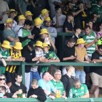


A theme that came up during both meet the owner events last week was around the club identity and branding.
Some want to see a return to the crest which was replaced in 2024 with the current logo. The change has divided opinion ever since, but there is definitely strong emotions around the previous logo, which was never totally removed from Huish Park.

We discussed this on today’s podcast which you can listen to here and thought we’d throw out a poll, that IF the club was to offer supporters the choice of keeping the new, or bringing back the old…how would you vote?
Gotta admit when you see them side by side now, the old badge looks awful. Keep the new and move on and move on
Aside from the actual logo, which I’ve never been too worried about either way, my main gripe is how its put on the shirts! Can we argue for proper embroidered ones like the old days, or even just sewn on badges, rather than those terrible iron on transfers which fall off after a couple of wears?! That wound me up far more than that design of them 😂
Neither, new design please
Get rid of the new badge, if only because it was put in place under a clown of an owner. The more we can do to bury his ego trip, the better.
Keep the new design badge as it is about the Glover’s, where as the old badge doesn’t mean anything, lion’s????
So I’m voting keep the new, otherwise buying new shirts again and that cost money also not cheap is it!!!
It’s the new design that is completely meaningless to supporters, due to the removal of the club motto.
You obviously don’t understand what is on the old badge, so I’ll explain.
The admittedly slightly weird imagery inside the old badge shield is connected to St John the Baptist church. The “sticks” are used by priests, and called either croziers or sceptres.
The yellow Lions are connected to the Earl of Arundel, and seen on loads of other shields throughout England.
I’m not really fussed about the religious stuff on the old badge, but it would be good to see the motto, and the yellow Lions back on a new design.
The Earl of Arundel had a connection to Yeovil through the Manor of Hendford
Haven’t voted on the poll because I think the best thing to do would be to combine elements of both badges. The problem with the new design is it’s overly dominated by history, and the gloves symbolise industry that doesn’t exist in Yeovil anymore. Probably nobody in their 20s and 30s can remember gloves factories in local area, not relevant to them.
If you imagine a badge design with the structure of the Barcelona badge, that’s what I would do. Make the massive football a lot smaller, and move it down, and Yeovil Town FC text horizontal, not curved. Put this across the middle of the badge shape.
The sections above this, put 1 yellow lion from the old badge top right, and maybe some helicopter blades top left, for what Yeovil is now.
Add an Achieve By Unity banner (similar to Everton scroll banner) underneath the design.
Something like that with a bit more effort gone into it is what YTFC need I think.
Not just something that looks like it was drawn on the back of a beer mat down the pub.
And what I mean is… don’t just copy and paste images of the Lions etc from the old badge, and combine it with the new badge.
A proper modernised, and simplified image of 1 Lion in yellow.
So all the elements look like they tie together.
Old badge is about a 6/10… the new badge is a 2/10. If I only had a choice between the two, it would be the old.
But it’s a new design that combines elements of both badges that is needed really.
Don’t like the new one, should just play it safe and adapt the old into a circle like most clubs do nowadays. Also cheaper for printing etc
Oh and add the date, writing round the outside ring. Can picture it and think it could look good. Imho of course. It’s cheaper and I’m tight so.
The new badge design was just done by Hellier so that he could leave his mark on the club, now he’s gone let’s remove any footprints he’s left! 💪🏻👍🏻
Just one comment, ytfc were NEVER called the ” glovers” until they moved to the nondescript new ground
We’ve been the glovers as long as I’ve been supporting them, which goes back to the 1970s.